Play by Instinct: Playful Fonts by Blaze Type.
Foundry collection
Typography
Type design
What happens when we leave behind traditional constructs and expectations, and instead embrace play and exploration?
Through three collaborations with multi-disciplinary creatives, we’re exploring just that — what happens when we create for the sake of creating, and the ways creativity and intuition can transform typography into a playful and multi-sensory experience.
Our first collaborator in this series is Blaze Type, an independent type foundry based in France. They’ve curated nine of their typefaces that embody a sense of playfulness and outside-the-box thinking. Read on and get inspired.
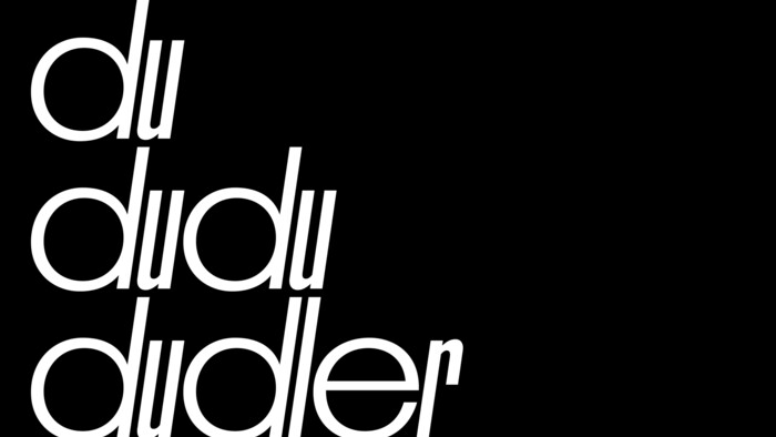
Dudler
Dudler is a typeface inspired by a Swiss truck spotted at a gas station in Val Venosta Valley. Narrow, slanted letters and straight, paired, wide, and round shapes given this typeface style and verve. Stylistic narrow alternates for every wide glyph allow designers to play with rhythm and create unexpected combinations. Dudler’s slight italic angle of 8° brings dynamism to its design and lendseven more personality to any type of composition. Its striking visual language makes it well suited for display and headlines in all kinds of projects: posters, websites, motion projects, and more.
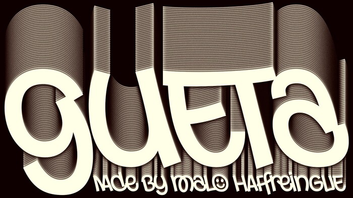
Gueta
Gueta is a backslant font that embodies the fusion between urban street art and contemporary typographic expression. It pays homage to the fluidity, spontaneity, and singularity of tagged forms. With its exceptionally rich set of 293 ligatures, which can link up to 5 letters at the same time, Gueta offers a unique typographic experience where shapes connect with dynamic force. Whatever the usage may be, from striking posters to impressive graphics or memorable headlines, this display typeface propels its expressive power that won’t go unnoticed.
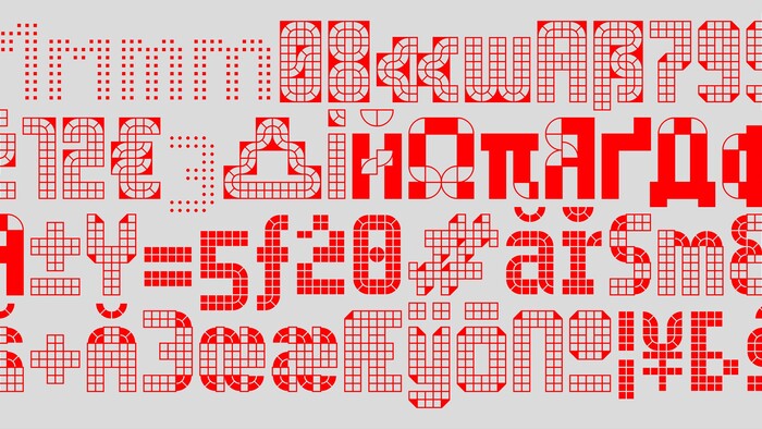
Systm
SYSTM is a modular and metric font family built with two components: a quadrant and a square, displayed on a grid. SYSTM will satisfy any grid obsession while evoking urban pavement, brutalist architecture, early interface designs, and modular design in the broadest sense. Featuring one variable axis that adjusts to the outlines’ thickness, SYSTM lets designers reach any kind of style, weight and text grayness. Above all, SYSTM has been designed to provide an efficient and versatile visual identity tool – including over 1,000 glyphs, multiple stylistic sets, and grids both for Latin and Cyrillic letters.
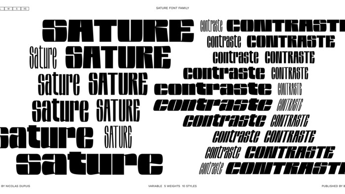
Sature
Designed from large-print lettering drawn on paper, the Sature font family came from a desire to create a complete family that unfolds. The letters are the result of an adjustment of hand-made lettering. All styles can be used together to create contrasts in the layout. The name of the font comes from the French word “Saturer,” meaning to overtake with excess. A variable font gives the impression that the letter doubles in size between each style, like a felt-tip marker that enlarges the letter. Horizontal processing was carried out to give the letters their fullness, making it easy for use in large sizes and high-impact messages.
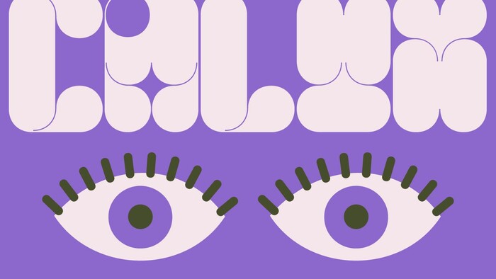
Calyx
Calyx is a blocky, modular typeface inspired by botanical shapes, specifically by flower petals. Its generous chunky forms are carefully crafted to give 60s and 70s vibes. Calyx aims to bring out your inner child in playful contemporary designs, with a healthy dose of retro cool that is perfect for headlines and graphic explorations. Though Calyx features only one weight, its uniquely shaped glyphs will elevate any design it’s used for.
Zoo
Zoo Display is a strong and high-contrast display typeface. The inspiration for Zoo comes from the lettering found on the vinyl sleeves of a French jazz music band called Zoo. The letters Z and O established the construction constraints of the design of the full character set. The asymmetrical distribution of the shapes gives it boundless energy. Zoo combines sharpness and roundness, at once delicate and sturdy, with a touch of jazz.
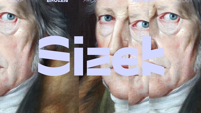
Sizek
Sizek is an experimental display typeface that reimagines and deconstructs the classical calligraphic structure of letters. It takes inspiration from digital glitches, lags, and damaged or half-loaded files, reflecting the challenges and quirks of working with technology. Sizek presents a fractured, harsh, and edgy aesthetic. Letters are disrupted by intentional breaks and divisions, reassembled into unconventional shapes and counters. These irregular forms also evoke a sense of human nervousness and physical tics, reflecting the chaotic beauty and unpredictability of the digital age.
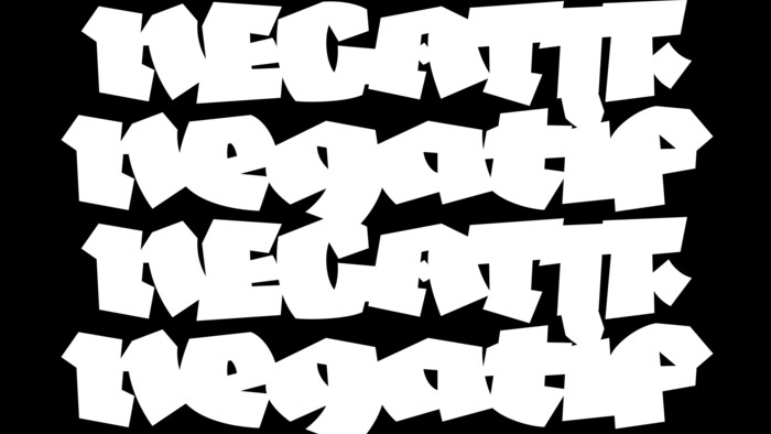
Negatif
Negatif comes from an intention to simplify the gothic letter with a unique black style. The letterforms are rooted in calligraphic research and were cut out in black paper to create raw, angular, rough-cut forms. Negatif imagines type as sculpture while retaining the gothic inspiration. The most unique feature of Negatif is its spacing. Carried out from Glyphs app, the letters touch each other and have been reworked to create a solid and black block of text. The letters have been designed to be displayed in large use cases where that sculptural quality is unmistakable. They are bold enough to add textural effects and to play with overlays. It’s up to you to reveal your darkest side!
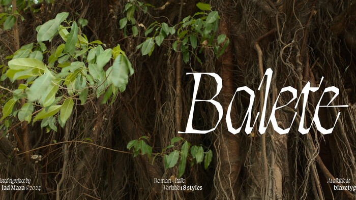
Balete
Balete evokes the eerie structure of the balete tree, infamous in Philippine folklore for being a dwelling place of supernatural beings. Characterized by dangling roots which the hemi epiphytic species uses to strangle and eventually consume its host tree victim, the letterforms feature creeping, slender tendrils that emerge from twisting stems, wrought from the illusion of fluid calligraphy without the presence of a single curved line. With various spirits in local mythology said to inhabit its hollows, from faint apparitions to hefty chain-smoking giants, the type family consists of distinctly drawn Roman and Italic styles ranging from the hypnotic Thin to charismatic Black weights. Just as its monstrous growth and enchanting tales prevent humans from tearing down its old-growth roots, Balete is beguiling enough to tell haunting stories and create spellbinding compositions begging for a bit of mystique.
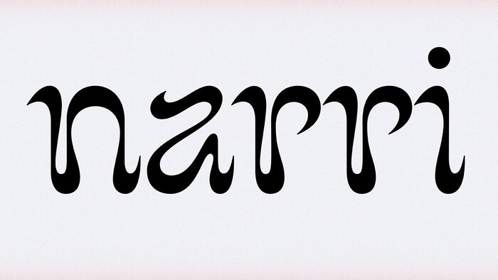
Narri
Narri is a playful display typeface designed by Elsa Drevous. The system is created with curvy lines, strong inverted contrast and sharp endings, resulting in organic calligraphic shapes. Not following the classic rules of calligraphy and mixing influences, the rendering is non-conformist and unique. The design is inspired by the dancing shapes of flames. The ornamental form of this typeface also allows glyphs to be used as decorative letters, or simply as distinctive shapes. The strong identity of the design makes it a perfect font to create lively distinctive branding projects.