Your favorite font pairs, statistically speaking.

Your favorite font pairs, statistically speaking.

Typography

Design

Digital branding

Font legibility

Creativity

Powered by AI, Monotype’s new Font Pairing engine is a formidable creative tool that makes the font selection process quicker and easier than ever while expanding your design options with countless inspiring font pairs.

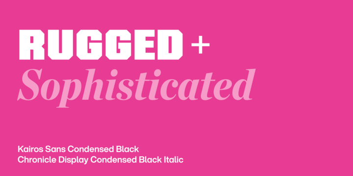
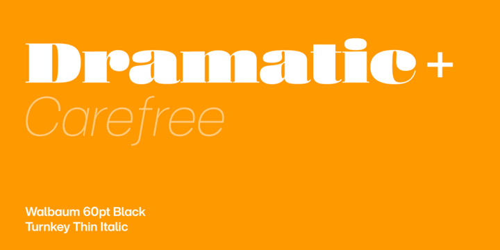
Using data on how creatives using Monotype Fonts employed this tool, we selected the four font pairs that you loved the most, adding them to your projects and saving them to your favorites at the highest rates.

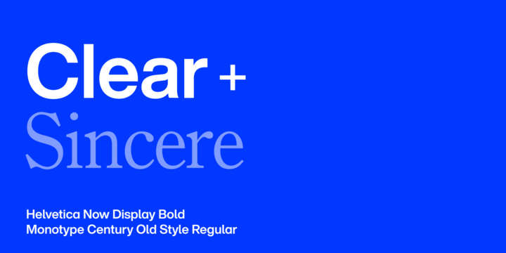
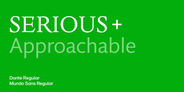
Let’s examine these four pairings in depth to understand what makes them so appealing to creatives.

Helvetica & Century.


As you decide which fonts to use, you don’t always need to opt for the flashiest or most unique font pair. There’s a time and a place for ornate, innovative visuals—many times and places, in fact!—but what about when the main goal of your project is comprehension?  

Let’s say you’re working on informational materials for a hospital to connect patients with surgeons, or for a city government to help residents locate the department where they can report a problem. In cases like these, choose a straightforward layout and font pairs that are clear and easy to read, like the quintessential pairing of Helvetica and Century.  

Monotype Head of Creative Graham Sturt calls Helvetica “the go-to typeface for countless brands seeking clarity and simplicity, embodying a no-nonsense approach to communication.” Meanwhile, Century is an old-style serif that features “soft, rounded serifs and moderate stroke contrast, which give it a sense of approachability and sophistication.”

Besides choosing highly legible fonts, maintain a clear visual hierarchy by ensuring that each font has a defined, consistent purpose. Consider using a sans serif like Helvetica for headlines and a serif like Century for body text.  

As Graham describes the pairing, “Helvetica’s uniform strokes and minimalistic approach provide a crisp, modern counterpoint to the more humanistic qualities of Century Old Style. The serif’s subtle curves and slight variations in stroke width add depth and texture, making it the perfect partner to Helvetica’s straightforward design.” It’s hard to imagine a more perfect pairing.

Kairos Sans & Chronicle Display.


Despite their completely opposite personalities, this pairing comes together beautifully, says Graham Sturt: “The pairing of Kairos Sans and Chronicle Display is all about balancing strength with grace. Kairos Sans’s geometric precision is offset by the flowing, intricate forms of Chronicle Display, resulting in a harmonious contrast that feels both bold and sophisticated.”

In fact, it might not be entirely accurate to say that Kairos Sans and Chronicle Display make a great pairing despite their contrasts. Instead, their contrasts contribute to their successful partnership, with every aspect of each font balanced by a distinctive counterpoint in the other. Graham put it perfectly when he noted, “Where Kairos Sans provides clarity and structure, Chronicle Display adds a layer of depth and ornamentation.” This contrast creates near-endless opportunities for experimentation that lead to new and unexpected compositions.

It doesn’t hurt that even on their own, both Kairos Sans and Chronicle Display are endlessly expressive, offering an enormous range of weights, widths, postures, and optical sizes. Together, though, their creative possibilities are exponentially greater. 

Dante & Mundo Sans.


Seeking stylistic harmony in your typeface pairing? Look no further than Dante and Mundo Sans.  

As Monotype’s Creative Type Director Terrance Weinzierl comments, “Both are tasteful and smart without being lavish. The stroke contrast and modulation, the thicks and thins, look sophisticated, honest, and rich.” Although one is a sans and one is a serif, they’re both humanist typefaces abstracted from calligraphy, and they’re both easy on the eyes.

But what about their differences? Let’s use an analogy: the classic Dante evokes

materials like paper and stone, while the more modern Mundo brings glass and metal to mind.  

Examples of applications that would work well for this font pairing include print publications, using Mundo Sans for headlines and Dante for text, with the opposite typographic palette (i.e., Dante large and Mundo small) for the digital version. For branding, we envision this pairing working perfectly for restaurants and hospitality, luxury, fashion, home goods, and health/beauty packaging.

P.S. Did you know that Mundo Sans already has a built-in serif companion, one that’s even more harmonious than Dante? Consider including Mundo Serif in your typographic palette as well—with these three fonts, you’ll have even more stylistic range, including the option to create more complex hierarchies. 

Walbaum & Turnkey.


This dynamic pair embodies the expression “opposites attract.” Walbaum is a warmly rendered Neoclassical serif, while Turnkey is a Neo-grotesque that leans into its geometric features. Terrance Weinzierl summed it up best when he commented, “If Walbaum is the dashing sports car, Turnkey is the self-made, denim-wearing driver.”

Although these two fonts are near-opposites, their shared details—especially Turnkey’s quirky elements—create the bond in this pairing. Their stroke contrast differs (Walbaum’s is high, Turnkey’s is low), but the two fonts’ proportions are compatible. In addition, Turnkey’s ink traps (empty spaces included at certain stroke intersections to prevent ink from bleeding, especially for small text) are a formal connection to Walbaum’s serifs—they create similarly rectangular shapes in negative and positive space, respectively.

Turnkey also offers soft styles with rounded edges that complement Walbaum’s subtle rounding to create notes of harmony in a chorus of contrast. And Turnkey’s curvy and exuberant characters (like its “k” and “R”) help it keep up with Walbaum’s panache.  

Depending on which of the two fonts you feature as the dominant typeface, you have considerable leeway to turn up or tone down this pairing’s “visual volume and vibration,” as Terrance puts it.

Unexpected pairings like this one—akin to finding two needles in a haystack—represent the kinds of unique combinations that our Font Pairing tool uncovers.  

Try our Font Pairing tool for yourself.

The power of AI makes it easy to discover pairings that might not have otherwise occurred to you. Use our Font Pairing tool to not only save valuable time and energy, but also to take your design game to the next level.

Ready to try AI-powered font pairing? Get started by logging into Monotype Fonts or signing up for a free 30-day trial.  

To learn more about our Font Pairing tool, watch our on-demand webinar led by Creative Type Director Terrance Weinzierl and Monotype Fonts expert Jay Loo. If you have more questions, check out our detailed Help Center guide to the Font Pairing tool